Visualize Your Decisions: How Geofuse Helps You Tackle Business Questions
Ever found yourself staring at a mountain of data, wondering how on earth to make sense of it all? You’re not alone. A lot of us in business struggle with turning complex information into actionable insights. That’s where tools like Geofuse come into play.
What Is Geofuse?
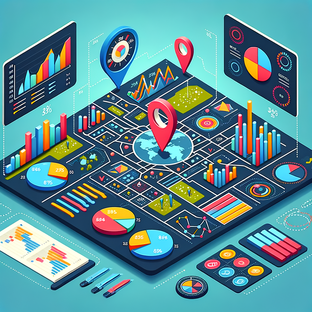
So, what’s Geofuse? It’s a tool designed to help you create visual maps that make tough business questions a bit easier to navigate. Picture this: instead of sifting through endless spreadsheets and reports, you can see your data laid out visually. It’s like taking a breath of fresh air after being stuck in a stuffy room.
Why Visualization Matters
When you’re facing a tough business challenge—like deciding where to open a new store or understanding your customer demographics—visualizing your data can make a huge difference. It’s one thing to see numbers on a page; it’s quite another to see that data represented visually. Suddenly, patterns emerge that you might have missed.
For example, let’s say you’re trying to figure out where to launch a marketing campaign. By using Geofuse, you can create a map that shows customer hotspots, demographics, and even competitor locations. This visual representation can help steer your decision-making in a direction that’s not just data-driven but clear and focused.
Getting Started with Geofuse
Diving into Geofuse is pretty straightforward. You’ll find that it offers intuitive tools to upload your data. Then, you can begin mapping out insights. Here’s a quick rundown of what you can expect:
– User-Friendly Interface: Even if you’re not a data whiz, the platform is easy to navigate.
– Customizable Maps: Tailor your visuals to focus on the data that matters most to you. Want to highlight sales performance by location? Go for it!
– Sharing Insights: Once you’ve crafted your maps, you can easily share them with your team or stakeholders. No more boring presentations filled with endless numbers.
Real-Life Application
Let’s say you’re the manager of a coffee shop chain, and you want to open a new location. You could pull data about foot traffic, demographics, or even local competitors. With Geofuse, you can visualize that data and see, at a glance, where your ideal location might be. You’re not just guessing; you’re making informed choices based on clear insights.
Making Smarter Location-Based Decisions
The best part about Geofuse is the clarity it brings. When you’re armed with visual insights, you can make sharper decisions based on real data. Whether you’re a small business owner or part of a larger organization, this kind of visibility can save you time and effort.
Closing Thoughts
In a world where data can be overwhelming, having a tool like Geofuse feels like having a compass in the wilderness. It takes the tough questions and breaks them down into manageable maps and insights, making your decision-making process that much smoother.
So, if you find yourself grappling with location-based decisions, give Geofuse a try. You might be surprised at how a little visualization can lead to big breakthroughs. At the end of the day, being able to see your data visually is not just a convenience; it’s a smart way to ensure you’re making the best decisions possible for your business. Cheers to clearer insights and sharper decisions!
Source: Geofuse – https://taaft.co/geofuse-r/
Discover more from Broadhaha
Subscribe to get the latest posts sent to your email.